-
(기초) 1-2. Compose 기본 UI - Text, TextField, Image, Row, Column, Box안드로이드 학습/Compose 2025. 9. 10. 17:25
1. 기본적인 Text
@Composable
fun customText() {
    Text(
        text = stringResource(R.string.first_text), // Text 글자
        modifier = Modifier
            .size(width = 80.dp, height = 100.dp) // text 영역 사이즈 설정
            .padding(start = 10.dp, bottom = 15.dp) // padding 설정
            .clickable(onClick = { Log.d("TestActivity", "click") }),
        color = Color.Green, // 색상 설정
        fontWeight = FontWeight.Bold, // font 굵기
        fontStyle = FontStyle.Italic, // font 스타일
        fontSize = 12.sp, // 글자 크기
        textAlign = TextAlign.Center, // Text 위치
    )
}
Text 기타 속성들 :
더보기- letterSpacing = 2.sp, // 글자 간격
- lineHeight = 28.sp, // 줄 간격
- textDecoration = TextDecoration.Underline, // 밑줄 효과
- overflow = TextOverflow.Ellipsis, // 길면 ... 표시
- softWrap = true // 자동 줄바꿈 여부
2. TextField
TextField(
    value = textField, // 현재 입력된 값
    onValueChange = { textField = it }, // 값이 변경될 때 호출되는 콜백
    leadingIcon = {  // 입력창 왼쪽에 나오는 아이콘
        Icon(
            imageVector = Icons.Default.Search, // 기본 검색 아이콘 사용
            contentDescription = null // 접근성 설명 (null로 두면 스크린 리더에서 무시)
        )
    },
    colors = TextFieldDefaults.colors( // TextField의 색상 지정
        unfocusedContainerColor = MaterialTheme.colorScheme.surface, // 포커스되지 않았을 때 배경색
        focusedContainerColor = MaterialTheme.colorScheme.surface // 포커스되었을 때 배경색
    ),
    placeholder = { // 힌트 텍스트 (아무것도 입력되지 않았을 때 표시)
        Text("Search")
    },
    modifier = modifier
        .fillMaxWidth() // 너비를 부모 크기에 맞게 설정
        .heightIn(min = 56.dp), // 최소 높이 설정
)
TextField 기타 속성들
더보기visualTransformation = PasswordVisualTransformation(), // 입력된 값을 비밀번호 형태(●●●)로 변환 keyboardOptions = KeyboardOptions(keyboardType = KeyboardType.Password), // 키보드 타입을 비밀번호 입력용으로 설정3. Image
a) 네이티브에 있는 이미지 로드 하는 방법
Image(
    painter = painterResource(id = R.drawable.fc2_nature_meditations),
    contentDescription = stringResource(id = R.string.align_your_body),
    modifier = Modifier
        .size(150.dp)
)
painterResource API를 사용해서 이미지를 로드한다. 아래와 같은 Drawable 유형을 지원
- AnimatedVectorDrawable
- BitmapDrawable(PNG, JPG, WEBP)
- ColorDrawable
- VectorDrawable
b) 인터넷에서 이미지 로드
Coil 라이브러리를 : Kotlin 코루틴에서 지원하는 이미지 로드 라이브러리
1) build.gradle에 추가
implementation("io.coil-kt.coil3:coil-compose:3.1.0")
implementation("io.coil-kt.coil3:coil-network-okhttp:3.1.0")
2) AsyncImage
AsyncImage(
    model = "https://cdn.news.hidoc.co.kr/image/logo/favicon.ico",
    contentDescription = "Translated description of what the image contains",
    contentScale = ContentScale.Crop,
    modifier = Modifier
        .size(150.dp)
        .clip(RoundedCornerShape(16.dp))
)
추가적인 속성 :
contentScale = ContentScale.Fit,- ContentScale.Fit: 가로세로 비율(기본값)을 유지하면서 이미지의 크기를 균일하게 조정합니다. 콘텐츠가 크기보다 작으면 이미지는 경계에 맞게 확대 조정됩니다.
- ContentScale.Crop: 사용 가능한 공간에 맞게 이미지를 가운데를 중심으로 자릅니다.
- ContentScale.FillHeight: 경계가 대상 높이와 일치하도록 가로세로 비율을 유지하면서 소스의 크기를 조정합니다.
- ContentScale.FillBounds: 대상 경계를 채우도록 콘텐츠의 크기를 균일하지 않게 세로 및 가로로 조정합니다.
- 자세한 내용 : 링크
4. Column, Row, Box
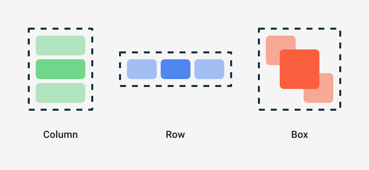
Row :
Row(
    verticalAlignment = Alignment.CenterVertically,
    modifier = Modifier
        .padding(10.dp)
        .horizontalScroll(rememberScrollState())
) {

}
속성들 :
- modifier : composable의 크기, 동작, 모양을 변경하거나 사용자의 입력을 처리(클릭, 스크롤 등)
- horizontalArrangement(Arrangement.Horizontal) : 수평 배치를 설정하는 변수
- verticalAlignment(Alignment.Vertical) : 수직 정렬을 설정하는 변수
- content : Layout 안에 들어갈 위젯을 설정하는 변수
더보기horizontalArrangement : (예 : Arrangement.Start)
- Start, Center, End, SpaceBetween, SpaceAround, SpaceEvenly
verticalAlignment : (예 : Alignment.Top)
- Top, CenerVertically, Bottom
Column :
Column(
    horizontalAlignment = Alignment.CenterHorizontally,
    modifier = Modifier
        .padding(10.dp)
        .verticalScroll(rememberScrollState())
) {

}
속성들 :
- modifier : composable의 크기, 동작, 모양을 변경하거나 사용자의 입력을 처리(클릭, 스크롤 등)
- verticalArrangement(Arrangement.Vertical 타입) : 수직 배치(Arrangement)를 설정하는 변수
- horizontalAlignment(Alignment.Horizontal 타입) : 수평 정렬(Alignment)을 설정하는 변수
- content : Layout 안에 들어갈 위젯을 설정하는 변수
더보기verticalArrangement (수직 배치) : (Arrangement.Top)
- Top, Center, Bottom, SpaceBetween, SpaceAround, SpaceEvenly
horizontalAlignment (수평 정렬) : (Alignment.Start)
- Start, CenterHorizontally, End
Box:
@Composable
fun CustomBox() {
    Box(
        contentAlignment = Alignment.BottomEnd,
        modifier = Modifier
            .background(color = Color.Cyan)
            .size(400.dp, 300.dp)
    ) {
        Text(modifier = Modifier.align(Alignment.TopStart), text = "First")
        Text(modifier = Modifier.align(Alignment.Center), text = "Second")
        Text(text = "Third")
    }
}
속성들 :
- modifier : 박스의 크기, 클릭 이벤트 등을 정의 가능
- contentAlignment : 자식의 기본 정렬 방식을 결정
- propagateMinConstraints : 최소 제약 조건을 전파시키는지 여부
- content : Box 레이아웃에 들어갈 레이아웃과 위젯이 람다식으로 들어가는 부분
더보기ContentAlignment : (예 : contentAlignment = Alignment.BottomEnd)
- Box 내부의 자식 위젯들의 기본 위치를 지정하는 값이다. 이 값이 지정되면 BoxScope에 있는 자식들의 기본 align이 이 값으로 지정된다.
그러나 위에 예제처럼 align을 이미 갖고 있다면 Box의 alignment가 전달되지 않는다.
'안드로이드 학습 > Compose' 카테고리의 다른 글
(기초) 1-4. Compose 상태 관리 (remember, mutableStateOf, rememberSaveable) (0) 2025.09.11 (기초) 1-3. Compose 고급 UI - LazyColumn, LazyRow (0) 2025.09.10 (기초) 1-1. Jetpack Compose : 기존 View 시스템과의 차이 (0) 2025.09.09 5. Compose와 MVVM (0) 2025.04.01 4. Compose Side Effect (0) 2025.03.27